Design tokens
A design token is a central location to store design related information such as colors, fonts, animations and so on. These raw values can then be transformed and be formatted to fit the needs of any platform.
“With design tokens, you can capture low-level values and then use them to create the styles for your product or app. You can maintain a scalable and consistent visual system for UI development.”
Introduction
What are design tokens?
Design tokens are all the values needed to construct and maintain a design system — spacing, color, typography, object styles, animation, etc. — represented as data. These can represent anything defined by design: a color as a RGB value, an opacity as a number, an animation ease as Bezier coordinates. They’re used in place of hard-coded values in order to ensure flexibility and unity across all product experiences.

Naming convention
We are using a design token structure and naming convention inspired by this article.
| Namespace | Object | Base | Modifier | |||||||||
|---|---|---|---|---|---|---|---|---|---|---|---|---|
System | Theme | Domain | Group | Component | Element | Category | Concept | Property | Variant | State | Scale | Mode |
$ids-color-accent | ||||||||||||
ids | color | accent | ||||||||||
$rlx-dark-mesh-background-color-1 | ||||||||||||
rlx | dark | mesh | background-color | 1 | ||||||||
$rlx-light-mesh-background-color-1 | ||||||||||||
rlx | light | mesh | background-color | 1 | ||||||||
$ids-primary-button-background-color | ||||||||||||
ids | primary-button | background-color | ||||||||||
$ids-avatar-border-color | ||||||||||||
ids | avatar | border-color | ||||||||||
$ids-avatar-border-width | ||||||||||||
ids | avatar | border-width | ||||||||||
$ids-avatar-status-size-2 | ||||||||||||
ids | avatar | status | size | 2 | ||||||||
Design token types
Global tokens
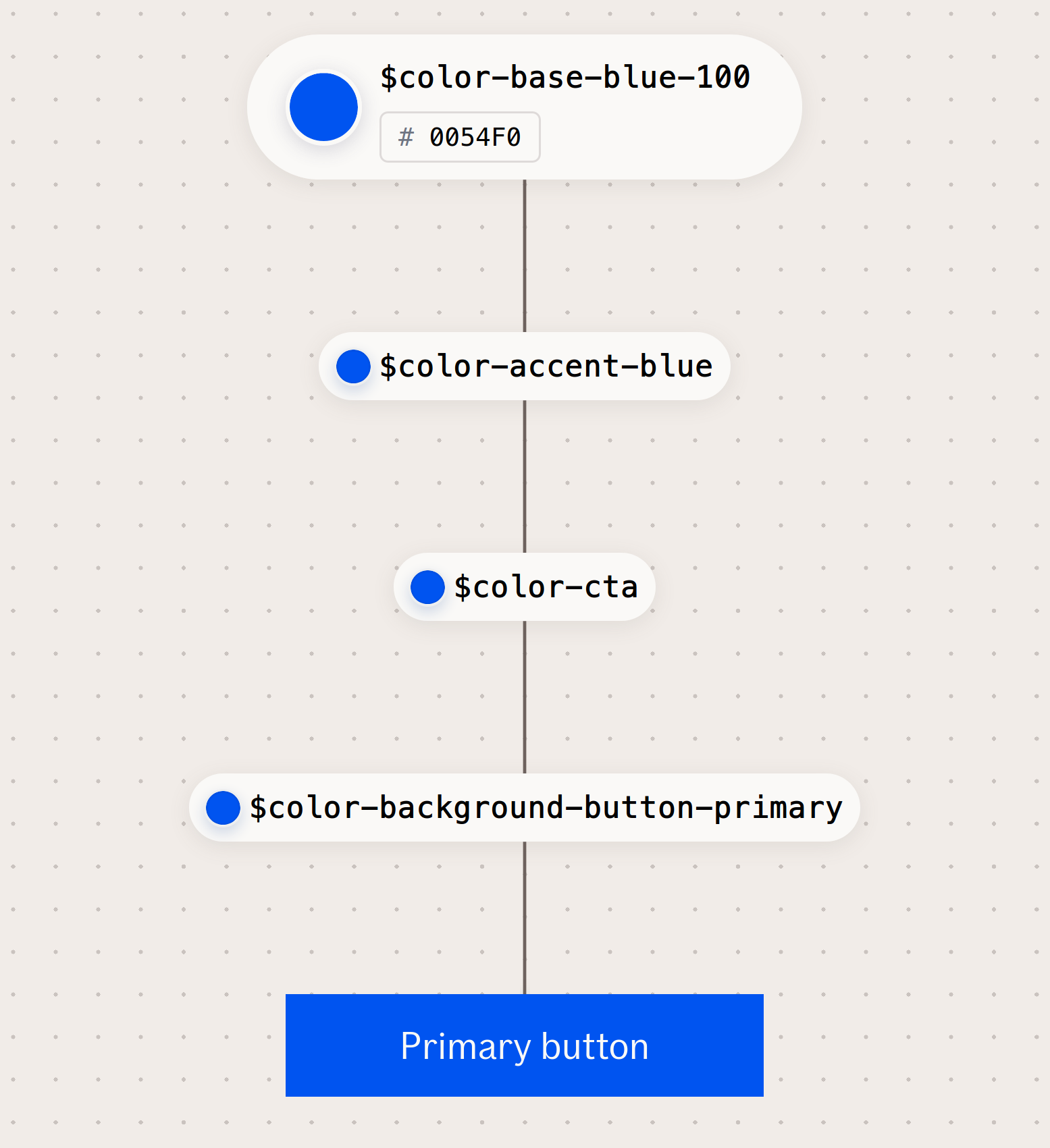
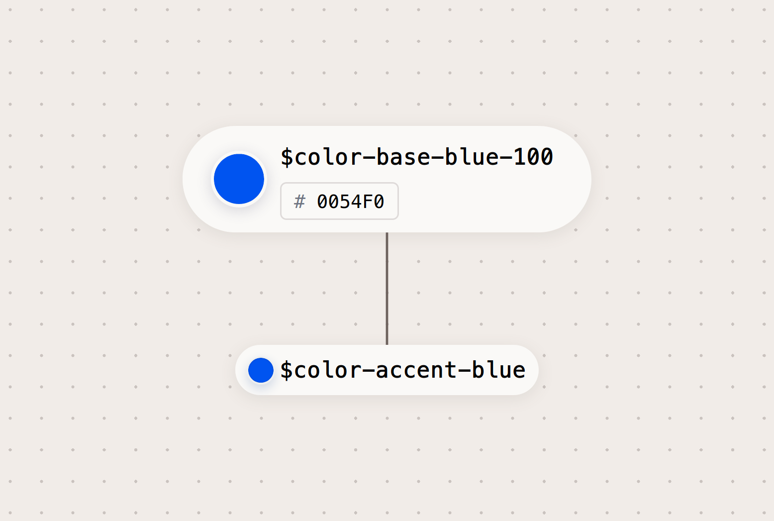
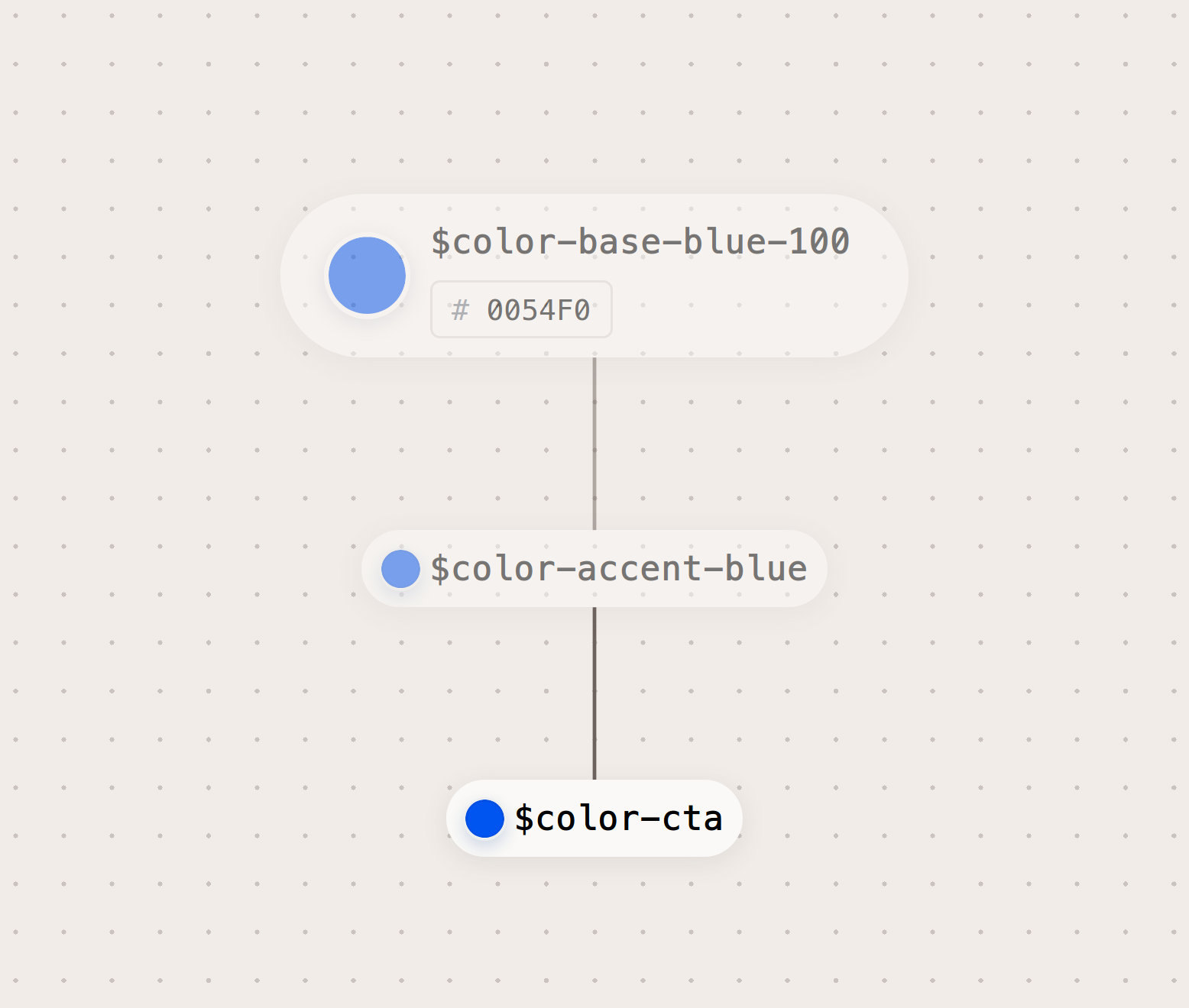
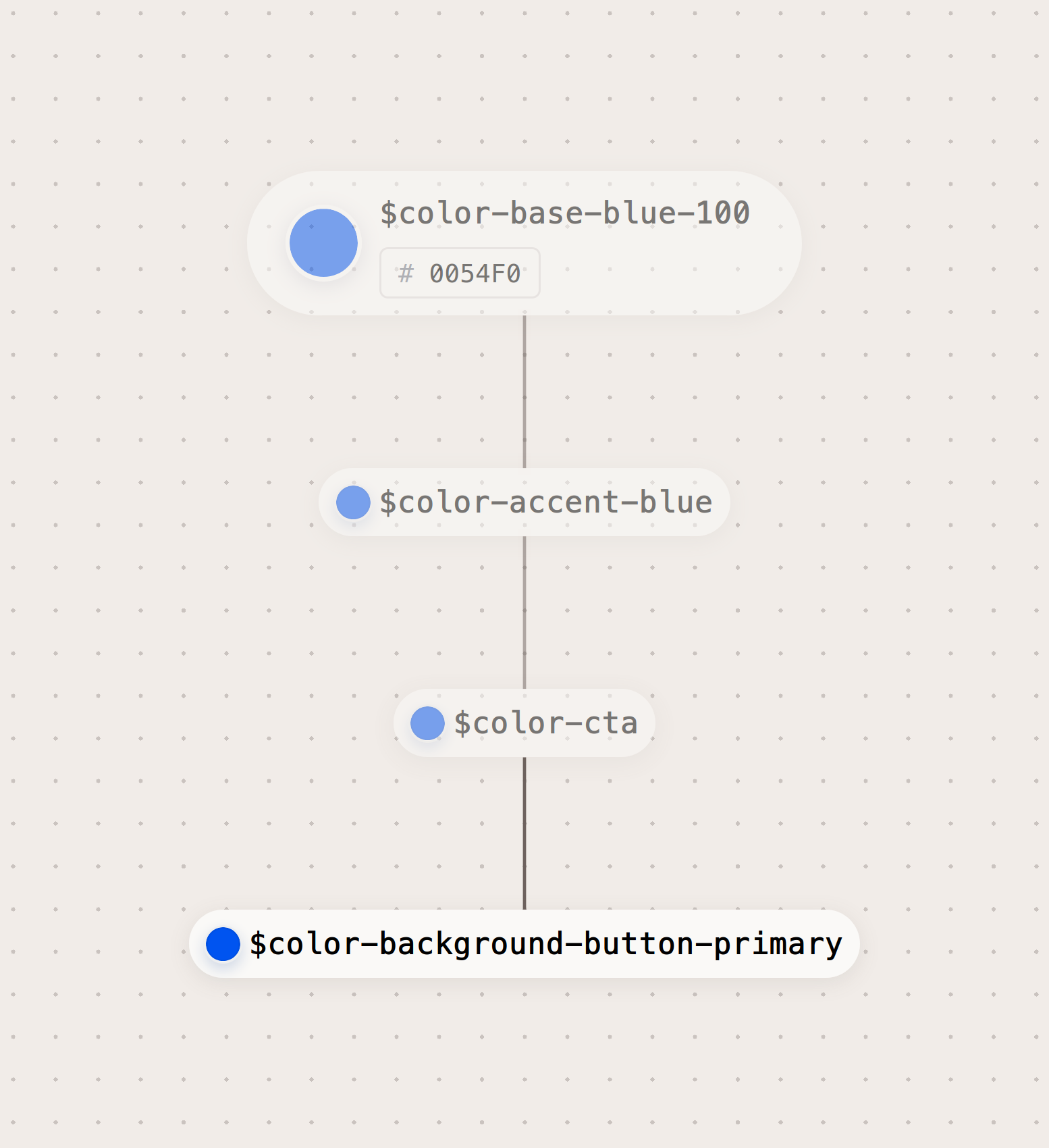
Global tokens are the primitive values in our design language, represented by context-agnostic names. Our color palette, animation, typography, and dimension values are all recorded as global tokens. These can be directly used, and are inherited by all other token types.

Alias tokens
Alias tokens relate to a specific context or abstraction. Aliases help communicate the intended purpose of a token, and are effective when a value with a single intent will appear in multiple places.

Component specific tokens
Component-specific tokens are an exhaustive representation of every value associated with a component. They often inherit from alias tokens, but are named in a way that allows engineering teams to be as specific as possible in applying tokens in component development.

Global tokens {# specific-global-tokens}
For more documentation about the global tokens, please see the respective documentation page:
Size tokens
Global size tokens are used for specifying dimensions and spacing for every If Design System component.
| Name | Value | Pixels | Example |
|---|---|---|---|
$size-4 | 0.25rem | 4px | |
$size-8 | 0.5rem | 8px | |
$size-12 | 0.75rem | 12px | |
$size-16 | 1rem | 16px | |
$size-20 | 1.25rem | 20px | |
$size-24 | 1.5rem | 24px | |
$size-28 | 1.75rem | 28px | |
$size-32 | 2rem | 32px | |
$size-36 | 2.25rem | 36px | |
$size-40 | 2.5rem | 40px | |
$size-44 | 2.75rem | 44px |
Color
Global color tokens are used as a base for color throughout the If Design System.
| Name | Value | Example |
|---|---|---|
$color-base-blue-1000054f0 | #0054f0 | |
$color-base-brown-1006e625e | #6e625e | |
$color-base-brown-200331e11 | #331e11 |
Component tokens
Component tokens are specific to given component only. The tokens can be override/used in themes with css variables.
| Name | Value | Example |
|---|---|---|
| $ids-avatar-border-color | rgb(110,98,94) | |
| $ids-avatar-status-size-2 | 1rem | |
| $ids-avatar-initials-font-size-3 | 1.375rem | A |
Table of Contents
Edit this section, Opens in new windowGuidelines
Use design tokens directly in your files, otherwise, use functions, mixins, or utility classes as in the examples below. See individual design token section in the component guidelines for more details.
Color tokens
| Token | Mixin | Utility Class |
|---|---|---|
$color-background-light-beige |
N/A | .if.color.background.light-beige |
$color-infographic-yellow |
N/A | .if.color.infographic.yellow |
Icon tokens
| Token | Mixin | Utility Class |
|---|---|---|
$if-icon-product-ai |
@include IDS_ICONS_Icon_Product_Ai |
.if.icon.product.ai |
$if-icon-ui-trashcan |
@include IDS_ICONS_Icon_Ui_Trashcan |
.if.icon.ui.trashcan |
Typography tokens
| Token | Mixin | Utility Class |
|---|---|---|
Aa$font-weight-126 |
N/A |
.if.font.weight-126 |
Microcopy tokens
| Name | 🏴 | 🇳🇴 | 🇸🇪 | 🇩🇰 | 🇫🇮 | 🇪🇪 | 🇱🇻 | 🇱🇹 | 🇷🇺 | 🇬🇱 |
|---|---|---|---|---|---|---|---|---|---|---|
$copy-choices-yes |
yes | ja | ja | ja | joo | jah | jā | taip | да | aap |
$copy-choices-no |
no | nei | nej | nej | ei | ei | nē | ne | нет | naamik |
$copy-choices-cancel |
cancel | avbryt | avbryt | annullere | peruuttaa | tühista | atcelt | atšaukti | аннулировать | annul |
$copy-choices-maybe |
maybe | kanskje | kanske | måske | voi olla | võib olla | var būt | gal būt | может быть | taamaassimavoq |
Usage
This walkthrough will guide you in how to use the design tokens from the design system.
Always make sure you have the latest code. For this example, we will use the design tokens from the color-package.
$ npm i @ids-core/colorImporting and using primary colors with SCSS/SASS
In your *.scss or *.sass file, you have for example a link that needs correct hover color
a.if:hover {
    color: ? ? ? ?;
}
Add the import from the design system (use your preferred build system to handle aliases and paths):
@import '~@ids-core/color/src/primary';

a.if:hover {
    color: ? ? ? ?;
}
Use the SCSS variable in your code:
@import '~@ids-core/color/src/primary';

a.if:hover {
    color: $color-interaction-dark-blue;
}
And you're done!
Importing and using support colors with JavaScript
An example with React:
import React from 'react';
import IF_COLORS_SUPPORT from '@ids-core/color/src/support';

const DisabledButton = ({ ...props }) => (
    <button
        type="button"
        onClick={...}
        onKeyPress={...}
        style={{
            backgroundColor: IF_COLORS_SUPPORT.blue.rgb
        }}
    >
        {title}
    </button>
)
Or:
import React from 'react';
import { colorBlueSupport } from '@ids-core/color/src/color-variables.module.js'

const DisabledButton = ({ ...props }) => (
    <button
        type="button"
        onClick={...}
        onKeyPress={...}
        style={{
            backgroundColor: colorBlueSupport
        }}
    >
        {title}
    </button>
)