Logotype
The If logotype is one of our most important brand assets. The If Blue color is functional, eye-catching and effective for interaction and activation. The circular blue disc bearing the word “if” and three white dots is our signature and trademark.
The If logotype should be used consistently across all channels. The If logotype should never be cluttered by, or linked to, other elements that reduce its legibility or visibility.
Table of Contents
Edit this section, Opens in new windowVersions
Our logotype is the primary representation of the If brand. It should always be used on first contact touch points, e.g. buildings, our homepage, posters and brochure front covers.
Primary logotypeThe primary logotype is a blue circle with the white wordmark.
Secondary blackThe secondary black logotype is a black circle with the white wordmark. This logotype is used only in circumstances when color representation is not an option, for example black and white printing or other printing methods such as embossing.
- Primary
- Secondary
Clear space and minimum size
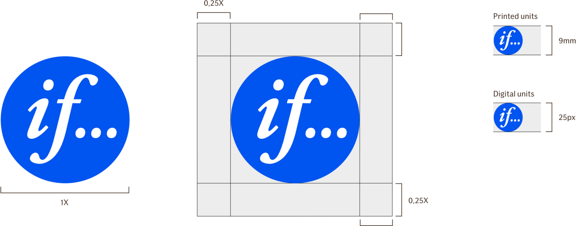
The clear space is calculated based on the width of the If logotype. You may not reduce the defined space around the logotype, but you may increase it.
To ensure optimal visibility, the If logotype must always be surrounded by an area of clear space (0,25x) where no other graphic elements or object intrude. However, the If logotype may be placed on images.
Minimum sizeThe If logotype may not be smaller than 9mm in height for printed units, or 25 pixels for digital units.
In general, the size of the If logotype should not be unnecessarily small in relation to other graphic elements in a given layout.
Placement
The If logotype should be placed with optimal visibility.
We typically center-align the logotype at the top or the bottom of all formats. In narrow horizontal format we place the logotype right-aligned, centered-vertically.
Sometimes the layout or background image dictates the placement of the logotype, and a secondary positioning may be used if necessary: right-aligned at the top or the bottom. The second positioning is never used in narrow vertical formats.
In video formats we always place the logotype right-aligned at the top.
-
Vertical formats
- Preferred positioning.
- Secondary positioning
-
Horizontal formats
- Preferred positioning.
- Secondary positioning
Examples
To ensure the integrity of the If logotype, please respect the following rules.
Here are some examples of incorrect usage.
Assets
-
 Complete Logotype Package
Our complete Logotype package, with all formats
Complete Logotype Package
Our complete Logotype package, with all formats
-
Digital Logotype Package
Our Logotype package for digital use
-
Master Logotype Package
Our Master Logotype package
-
Office Printing Logotype Package
Our Logotype package for office printing
-
Professional Printing Logotype Package
Our Logotype package for professional printing