Icons
Our icons are carefully designed to be as simple as possible, in a minimalistic style without unnecessary details. They serve a purely functional purpose and assist With clear and direct navigation.
The icons are based on Nucleo, a third-party library of symbols for iOS, Android and web projects. By adding a set of customized icons specially designed for If, we created a generic yet personal icon library.
Table of Contents
Edit this section, Opens in new windowStyle overview
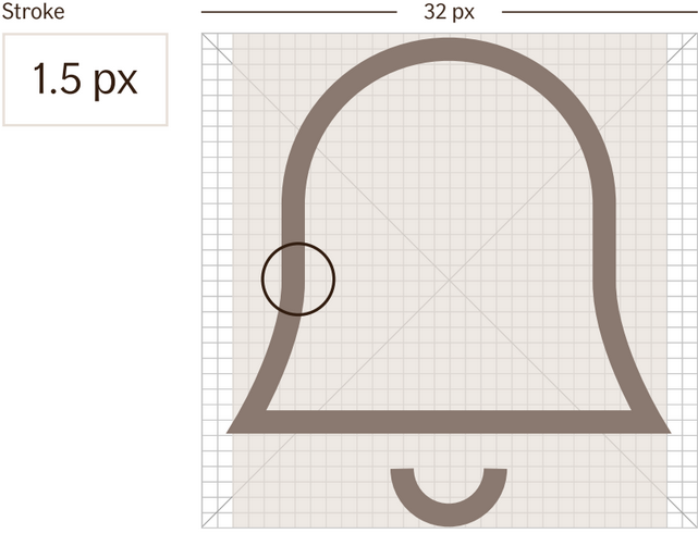
The If icon library uses outlined icons to match the typeface, If Sans. The icons have a stroke value of 1.5 PX.
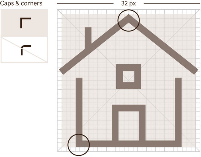
Cap and cornerAll If icons have Sharp caps and corners.
Icon gridThe icons use a 32 PX grid to get a minimal and simple expression With few, carefully chosen details. Icons are adjusted individually for a consistent optical volume over the whole icon family.
Categories
The If icon library is divided into four categories. Three descriptive categories - products, coverages and symbols - and one for UI.
The icon library also have country flags.
- Represent our products and services. Help customers to find the right product or service in lists and menus.
- Reinforce the meaning of a text. Should always be used together with a text label and never as a standalone.
- Represent our coverages and claim types. Help customers to find the right coverage or claim.
- Reinforce the meaning of a text. Should always be used together with a text label and never as a standalone.
- Represent actions, tools and general content.
- Help customers to find information and take actions, such as order, report and manage products and services.
- Reinforce the meaning of a text. Should always be used together with a text label and never as a standalone.
- Represent generic content with a functional purpose, such as guiding and navigating.
- Can be used as a standalone without a text label.
- Represent the country in the context.
- Cannot be used standalone.
Color and background
Sizes
The sizing of icons is context based. We use 16px and upwards based on the context. As long as the size of the icon adheres to the baseline grid (4px/8px), any size is useable, depending on contect.
Stroke, line widthIn some occasions the icons need to amend the stroke width manually, based on the placement and context of the icon.
Usage
Icons help the user find a desired action or piece of information relevant to their task. Icons can be used to mark a type of notification, status or validation, an action link or button, a type of insurance or sometimes (but rarely) an action button.
The icon should speak for itself and the user should understand what the icon means without reading the supporting text. Icons help the user scan to the correct action without reading text.
Do not use icons just for the sake of using an icon, or for decoration. We don't want to clutter the user interface with anything that is not absolutely necessary or beneficial to the user.