Data Visualization
Use this data visualization style guide to create a uniform look and feel to all of If's charts and graphs. This page contains guidelines that are in line with data visualization best practices and proven design principles. It also eliminates the burden of design and color decisions when creating charts.
The data visualisations are meant to visualise data in a intuitive and visually appealing way.
Table of Contents
Edit this section, Opens in new windowColors
When selecting colors for charts and graphs, we must first consider the type of data we are presenting. Usually, data can be grouped into one of two main groups: categorical or sequential.
Categorical palettes are best when you want to distinguish discrete chunks of data that do not have an inherent ordering.
Sequential color mapping is appropriate when data range from relatively low or uninteresting values to relatively high or interesting values. For sequential data, it's better to use a palette that has a relatively subtle shift in hue accompanied by a large shift in brightness and saturation.
This approach naturally draws the eye to the relatively important parts of the data. Sequential colors are used for sequential groups (not necessarily the way the data trends). So age groups young to old and date ranges might be something that use sequential colors.
The following color combinations are intended to take some of the guess work out of the process of assigning colors to charts. They're only examples, and can be mixed-and-matched depending on the story you are trying to tell with your data.
Color combinations
Chromatic
Main infographic colors
const infographicColors = [
  '#87c7ba',
  '#fcc74f',
  '#ff8569',
  '#4cb0d3',
  '#6b9994',
  '#b08759',
  '#805c5c',
  '#5392b2',
  '#b5ede8',
  '#ffe082',
  '#ffc9a6',
  '#97e2f7'
];
Monochrome
const colors = ['#e2dfde', '#c5c0be', '#a8a09e', '#8b817e', '#6e625e', '#584e4b', '#423a38', '#2c2725', '#151312'];Groups
When visualizing data, you can choose a predefined set of colors to use for grouping.
One group
For one color group, you can choose freely from the 4 primary infographic colors.
| Name | Value |
|---|---|
$color-data-chromatic-red | #ff8569 |
$color-data-chromatic-yellow | #fcc74f |
$color-data-chromatic-green | #87c7ba |
$color-data-chromatic-blue | #4cb0d3 |
Two groups
For two color groups, you can use these color combinations.
| Name | Value |
|---|---|
$color-data-chromatic-green | #87c7ba |
$color-data-chromatic-yellow | #fcc74f |
| Name | Value |
|---|---|
$color-data-chromatic-red | #ff8569 |
$color-data-chromatic-blue | #4cb0d3 |
| Name | Value |
|---|---|
$color-data-chromatic-green | #87c7ba |
$color-data-chromatic-red | #ff8569 |
Sequential
Use one of the primary infographic colors and pair it with the matching lighter secondary color.
| Name | Value |
|---|---|
$color-data-chromatic-light-green | #b5ede8 |
$color-data-chromatic-green | #87c7ba |
| Name | Value |
|---|---|
$color-data-chromatic-light-yellow | #ffe082 |
$color-data-chromatic-yellow | #fcc74f |
| Name | Value |
|---|---|
$color-data-chromatic-light-red | #ffc9a6 |
$color-data-chromatic-red | #ff8569 |
| Name | Value |
|---|---|
$color-data-chromatic-light-blue | #97e2f7 |
$color-data-chromatic-blue | #4cb0d3 |
Highlighting
If your visualization is for highlighting a value, you can use our background-colors BE 5, LIGHTEST BEIGE - BE 3, LIGHT BEIGE and pair it with our accent color or CG 2, GREEN. However, the background color used should be clearly distinct from the background color of the visualization.
| Name | Value |
|---|---|
$color-data-subtle-100 | #f1ece8 |
$color-data-highlight-blue | #0054f0 |
| Name | Value |
|---|---|
$color-data-subtle-100 | #f1ece8 |
$color-data-chromatic-green | #87c7ba |
| Name | Value |
|---|---|
$color-data-subtle-200 | #ede6e1 |
$color-data-highlight-blue | #0054f0 |
| Name | Value |
|---|---|
$color-data-subtle-300 | #e8e0d9 |
$color-data-highlight-blue | #0054f0 |
Three groups
For three color groups, you can use these color combinations.
| Name | Value |
|---|---|
$color-data-chromatic-green | #87c7ba |
$color-data-chromatic-yellow | #fcc74f |
$color-data-chromatic-red | #ff8569 |
| Name | Value |
|---|---|
$color-data-chromatic-green | #87c7ba |
$color-data-chromatic-red | #ff8569 |
$color-data-chromatic-blue | #4cb0d3 |
Sequential
Use one of the primary infographic colors and pair it with the lighter and darker versions.
| Name | Value |
|---|---|
$color-data-chromatic-light-green | #b5ede8 |
$color-data-chromatic-green | #87c7ba |
$color-data-chromatic-dark-green | #6b9994 |
| Name | Value |
|---|---|
$color-data-chromatic-light-yellow | #ffe082 |
$color-data-chromatic-yellow | #fcc74f |
$color-data-chromatic-dark-yellow | #b08759 |
| Name | Value |
|---|---|
$color-data-chromatic-light-red | #ffc9a6 |
$color-data-chromatic-red | #ff8569 |
$color-data-chromatic-dark-red | #805c5c |
| Name | Value |
|---|---|
$color-data-chromatic-light-blue | #97e2f7 |
$color-data-chromatic-blue | #4cb0d3 |
$color-data-chromatic-dark-blue | #5392b2 |
Four groups
For four color groups, you can use this color combination.
| Name | Value |
|---|---|
$color-data-chromatic-green | #87c7ba |
$color-data-chromatic-yellow | #fcc74f |
$color-data-chromatic-red | #ff8569 |
$color-data-chromatic-blue | #4cb0d3 |
Sequential
Use a combination of our monochrome colors.
| Name | Value |
|---|---|
$color-data-monochrome-100 | #e2dfde |
$color-data-monochrome-300 | #a8a09e |
$color-data-monochrome-500 | #6e625e |
$color-data-monochrome-700 | #423a38 |
Five groups
For five color groups, you can use this color combination.
| Name | Value |
|---|---|
$color-data-chromatic-green | #87c7ba |
$color-data-chromatic-yellow | #fcc74f |
$color-data-chromatic-red | #ff8569 |
$color-data-chromatic-blue | #4cb0d3 |
$color-data-chromatic-dark-red | #805c5c |
Sequential
Use a combination of our monochrome colors.
| Name | Value |
|---|---|
$color-data-monochrome-100 | #e2dfde |
$color-data-monochrome-200 | #c5c0be |
$color-data-monochrome-300 | #a8a09e |
$color-data-monochrome-400 | #8b817e |
$color-data-monochrome-500 | #6e625e |
Six groups
For six color groups, you can use this color combination.
| Name | Value |
|---|---|
$color-data-chromatic-green | #87c7ba |
$color-data-chromatic-yellow | #fcc74f |
$color-data-chromatic-red | #ff8569 |
$color-data-chromatic-blue | #4cb0d3 |
$color-data-chromatic-dark-yellow | #b08759 |
$color-data-chromatic-dark-red | #805c5c |
Sequential
Use a combination of our monochrome colors.
| Name | Value |
|---|---|
$color-data-monochrome-100 | #e2dfde |
$color-data-monochrome-200 | #c5c0be |
$color-data-monochrome-300 | #a8a09e |
$color-data-monochrome-400 | #8b817e |
$color-data-monochrome-500 | #6e625e |
$color-data-monochrome-600 | #584e4b |
Seven groups
Consider consolidating categories or breaking up the chart, seven groups are really too many.
Types
Geo charts
When using geo charts as a visualization tool:
- Make non-important countries a lighter beige to let the coloured countries stand out
- Do not display borders, rivers, lakes, poi's and roads
- Make sure you always have a legend present
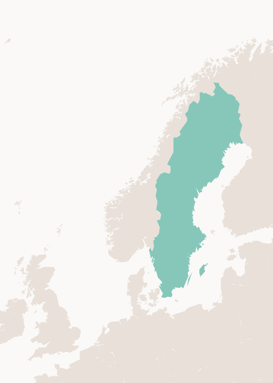
Combinations with charts
You can also combine a geo chart with other visualization types, like infographics or charts.
Infographic
Info box data highlight
This data visualisation is a basic info box, but instead of showing body text here, we highlight a certain number, with supporting text below the data.
This is always placed on the right of body text module.
Highlighted values
Highlighted values data visualisation is very much alike the Quick Facts, but here we work with data as the main focus. Supporting text under the respective numbers is to describe eventual data.
There is also support to highlight data extra much with the use of our active blue color. Do not overuse this.
There is also support for a hierarchal approach to this component which involved one line with larger data and another with smaller data below.
Charts
Spline
A spline chart is a line chart in which data points are connected by smooth curves: this modification is aimed to improve the design of a chart. Like the regular line chart, it is commonly used to emphasize trends in data over equal time intervals.
Usage
- To show the trend in one variable, usually over time.
- To show multiple variables with multiple lines (if they are on the same scale).
- To show the same variable for multiple observations with multiple lines.
Styling
- The y-axis should always start at zero.
- When possible, directly label series. If too close together, use a legend.
- Avoid individual data markers.
- Avoid dashed lines.
- In a single chart, try to keep the maximum number of lines to three or four. More is not always better. Plotting too many lines on the same chart gives a confusing picture and defeats the purpose.
- Sequential series should be shaded from lightest to darkest for easy comparison.
Positioning
This data visualisation can either be full width or placed to the right of body text component, or to the left with a legend on the right.
For basic legends, legend can be placed inside the chart (for example if there are two years in the legend only).
This version has dots for for the data point entry.
Horizontal bars
Horizontal Bar graphs are used to compare things between different groups or to track changes over time. However, when trying to measure change over time, bar graphs are best when the changes are larger.
This data visualisation can either be full width or placed to the right of body text component, or to the left with a legend on the right.
Usage
- To show the trend in one variable, usually across a number of categories.
- To show multiple variables with multiple bars(if they are on the same scale).
- To show the same variable for multiple observations with multiple lines.
Styling
- The y-axis should start at zero (there are a few instances when it is okay for the y-axis not to start at zero).
- Axis labels should always be horizontal. If you have long labels, consider making a horizontal bar chart instead of a column chart.
Thick comparison
Same basic function as horizontal bars, but here we only compare two numbers, usually of the same data, but before or after a change, or comparing two different data points during the same time.
Here we also highlight how much larger the above value is with the use of for example "3.2x (larger)".
There is also a choice for a small legend under each thick bar, this is to let the user know what the data is showing, for example If vs competitor. Not to be used for anything longer than 2-3 words.
This data visualisation can either be full width or placed to the right of body text component
Bars/Columns
A bar chart is used when you want to show a distribution of data points or perform a comparison of metric values across different subgroups of your data. From a bar chart, we can see which groups are highest or most common, and how other groups compare against the others.
This data visualisation can either be full width or placed to the right of body text component, or to the left with a legend on the right.
Bars can also do divided into multiple sections with each section being a different color to represent different data. There can also be sections of bars that are fitted closer together.
Usage
- For mostly for one variable
- To compares numerical values for different observations
- To show relative amounts
- To break one numerical variable out into different subgroups with grouped or stacked bars or columns
Styling
- If all the bars measure the same variable, make them all the same color. Different shades have no relevance to the data.
- If you are showing fewer than 10 bars, consider eliminating the horizontal gridlines and y-axis line and directly labeling the data points.
- To differentiate subsets of data, projections, or averages, consider using a different color shade or gray.
- Legends should be stretched across the top of the chart and the order should match the order in the chart.
- Sequential series should be shaded from lightest to darkest for easy comparison.
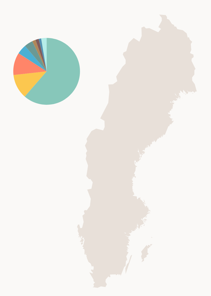
Pie
Browser market share if.ee
Usage
- Use them sparingly. Often a bar or column chart is better. It is difficult to visually judge the size of circles (or circle segments). These segments are easier to discern as rectangles on a scale.
- Use pie charts when you want to show the relative relationship between two or three things
- When they add up to 100 percent (which may necessitate the inclusion of a category such as "none", or "other").
Pie charts are generally used to show percentage or proportional data and usually the percentage represented by each category is provided next to the corresponding slice of pie. Pie charts are good for displaying data for around 6 categories or fewer.
This data visualisation is to be placed to the right of body text component, or to the left with a legend on the right.
Doughnut
Doughnut charts are used to show the proportions of categorical data, with the size of each piece representing the proportion of each category. Make sure that there are not too many slices.
This data visualisation is to be placed to the right of body text component, or to the left with a legend on the right.
Usage
Use data visualisation in any scenario where there is data that can be supported or better explained / visualised with a visual cue.
Data visualisation components should be used on the same backgrounds that body text components are used. This means that they do better on BE 5, LIGHTEST BEIGE to BE 3, LIGHT BEIGE, but are compatible with all backgrounds.
Principles
Sizing
Charts with natural large data-sets, like spline/column and bar can be full width.
Positioning
All charts can be placed to the right of body text component, or to the left with a legend on the right.
Behaviours
Data loads the second that its visible for the user one the page, ease in and ease out for the loading so they are smooth and gentle, but not too slow. Should be finished loading the second the user can decipher the data.
Interaction
Some data visualisations support interactions, whether that is directly, or a scenario where the user can change which data set the chart should show, eg. Changing which year the data visualisation is showing data from.
Usually this is below the data visualisation.
If the interaction can fit on one line, they are designed as a tab, with a uniform line under. If they need to be placed on multiple lines, underline each clickable selector instead, with blue line and bolded text for the current one.
If there is a need to show multiple data visualisations and the user should be able to toggle different years (for example) for all data visualisations, there is an option to put the interaction under the page title, and apply the change to all data visualisations.
Show visual example of this.
Accessibility
User can either hover or click on part of data to get further info, colors are also tested for accessibility, and there is also an option that when is enabled in browser, we show patterns instead of color.
Tables
If the data visualization is for information and not decorative/fill material, there should always be possible to view the data set as a table. It is also required to be able to export that table accordingly.
| Jane | John | Lisa | |
|---|---|---|---|
| Apples | 3 | 4 | 7 |
| Pears | 2 | 0 | 4 |
| Plums | 5 | 0 | 11 |
| Bananas | 1 | 12 | 1 |
| Oranges | 2 | 4 | 7 |
Color and accessibility
Color with patterns
To be able to distinguish colors in charts for color blindness or visual impairment, patterns could be used.
Patterns without color
When used without different background-colors, a default background-color (dark) should be set.
Patterns with color
Color blindness tests
Here is a selection of 8 color blindness variations of the main infographic colors used here.
Protanopia
With patterns
Protanomaly
With patterns
Deuteranopia
With patterns
Deuteranomaly
Tritanopia
Tritanomaly
Achromatomaly
Achromatopsia
With patterns
Moderate vision loss
With patterns
Severe vision loss
With patterns
Anatomy
Typography
| Typeface | Font-size | Font-weight | Color | |
|---|---|---|---|---|
| Title | If Sans | 1.5rem | 64 | BR 1, BROWN |
| Subtitle | If Sans | 1rem | 82 | BR 1, BROWN |
| Y and X-axis labels | If Sans | 14px | 78 | LB 1, LIGHT BROWN |
Tooltip
Tooltip to show further info about data is activated on hover on desktop or click on mobile.
The popover component design is used with charts.
Legend
A legend is always recommended to use with all graphs where data is hard to understand.
In cases where there is an interaction, make sure that the data is somewhat easy to understand before letting the user interact with it. It is not optimal, but interactions and legend can be placed together. Interaction is always closest to data, legend below in mobile or to the side in desktop.
Variations
| Type | Purpose |
|---|---|
| Dot | A legend with dots |
| Line | A legend with lines |
Usage
Types
A legend can be marked with a symbol/color, relating the legend item to the visualization.
This could either be a filled circle (dot), or a thick line.
Att flytta pensioner i allmänhet och tjänstepensioner i synnerhet kan vara både krångligt och tidskrävande.
Sizing
The legend should follow the layout principles from the grid, and there are 4 sizes available to use.
- 6 cols (50%)
- 5 cols
- 4 cols (30%)
- 12 cols (100%)
Positioning
The legend should always be positioned accordingly; either to the right/left of the chart, or below the chart.
Further reading
Here's some articles for further reading on the subject
- Make grey your best friend
- What to Consider When Choosing Colors for Data Visualization
- How to Choose Colors for Your Data Visualizations
- Collection of blog posts regarding the subtleties of color